The Problem
In 2015, Fossil Group recognized a sharp decline in traditional watch sales and identified an opportunity to revitalize the market by incorporating smart technology. This gave rise to the hybrid smartwatch, catering to an underserved market of consumers who valued style but were not drawn to existing smart accessories like the iPhone, Fitbit, or Android smartwatches. To develop the first generation of products and the UI design for the companion app, Fossil partnered with an external agency.
However, the app's framework proved unable to adapt and support the expanding hybrid watch product line.
My role
I was a core member of the Fossil Q app redesign, working closely with two fellow product designers, one product manager, our international engineering team and Fossil brand design team. Our product team had a goal to be transparent and inclusive with other teams that supported the smartwatch division. Through inter-departmental workshops and retrospective meetings, we made it a point to have each team represented in the room.
Partnering with the Art Director of the Fossil brand design team and Marketing specialists was crucial to translating the Fossil DNA that existed in print and digital into the product space.
The app launched globally in October 2017.
The Solution
By the following year, the wearable market was rapidly evolving, driven by the growing popularity of full-display smartwatches. Fossil Group knew its competitive edge in a tech-forward wearables market: a fashion conscious end user who cared about the benefits of a smartwatch as much as they did about how it looked.
Because Fossil Group's portfolio showcased big fashion brands that partnered with Fossil's watchmaking expertise, our team had to make sure the designs were scaleable across distinct brands. Our white label solution not only enhanced the overall customer experience but also introduced customizable design system components for the brand team, significantly reducing both design and development time.
Our user
Sofia wears a traditional wrist watch as she prioritizes style. She loves the Fossil brand because it's fashionable and whimsical, much like her own personality.
She thinks it would be convenient to be able to receive notifications on her wrist while in meetings and fun to see her Activity progress throughout the day, but overall, she’s not really interested in all the bells and whistles of the Apple Watch.
The Process
For the new design, we introduced a revamped process that involved user testing to identify key challenges and desired outcomes for launch.
Project Goals:
Improve the user experience of the inherited app design based on insights from user testing.
Establish a revenue stream through data-driven testing, implementation, and execution.
Create opportunities for brand-to-consumer engagement.
Prioritize simple design solutions to minimize the learning curve for hybrid smartwatch users.
Establish a revenue stream through data-driven testing, implementation, and execution.
Create opportunities for brand-to-consumer engagement.
Prioritize simple design solutions to minimize the learning curve for hybrid smartwatch users.
What we learned about the old design
The first-time user experience is highly limiting, exclusive and too utilitarian. There were opportunities for branding, but not much else for potentially capturing new users or educating on the benefits of owning a Fossil Hybrid Smartwatch.
The objective of the Fossil Q app was unclear. There were users who downloaded the app thinking it was a lifestyle app from Fossil itself.
Business needs
Support marketing efforts for the Hybrid Smartwatch
Educate curious customers
Lead to potential conversion
Principles
Allow user to learn about Fossil Hybrid without a device or an account
Drive traffic to purchase a watch
Design a UI that allows “brandability” - the UI framework flexibility to support licensor brands
Constraints
Inherited framework from design agency
Limited quality data
International engineering team
Maintainability requirements
Too many cooks in the kitchen
KPIs
Increase traffic to retail website for Hybrid Smartwatches
Reduce churn rate and un-installations
Ideation and exploration
We thought about how we were going to bifurcate two possible users: one who has a device and another one who is exploring the app, without a device. Our goal was to educate, connect with, and entice the user to invest a Fossil Hybrid Smartwatch.
Our process
Working with our product manager, we gathered feedback from internal teams and brand stakeholders. The team worked out the UX , working through several iterations and prototypes.
After validating the design, we put together UX documentation with detailed user flows and specs, ensuring everyone involved had a clear reference. This became the go-to source for the final, approved design. From there, we handed off the UX work to Marie to apply the brand’s look and feel.
Once the UX was decided, we worked on the UI, keeping scalability across brands top of mind. We worked with our overseas development team to make sure that flows, UI components and brand guidelines were crystal clear. We even flew to Vietnam to work closely with the developers in the Fossil Vietnam office to collaborate closely. After returning, we continued to troubleshoot any UX issues that came up during the implementation of the mockups.
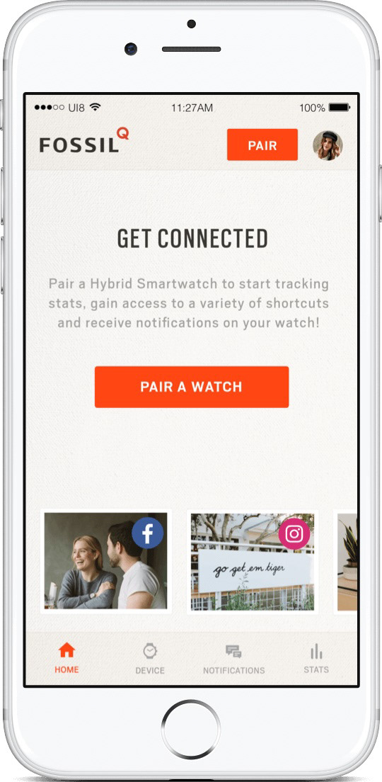
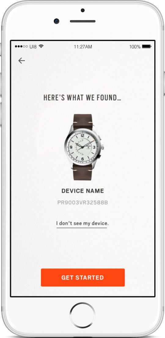
Flow of pairing a device to the app
Final solution
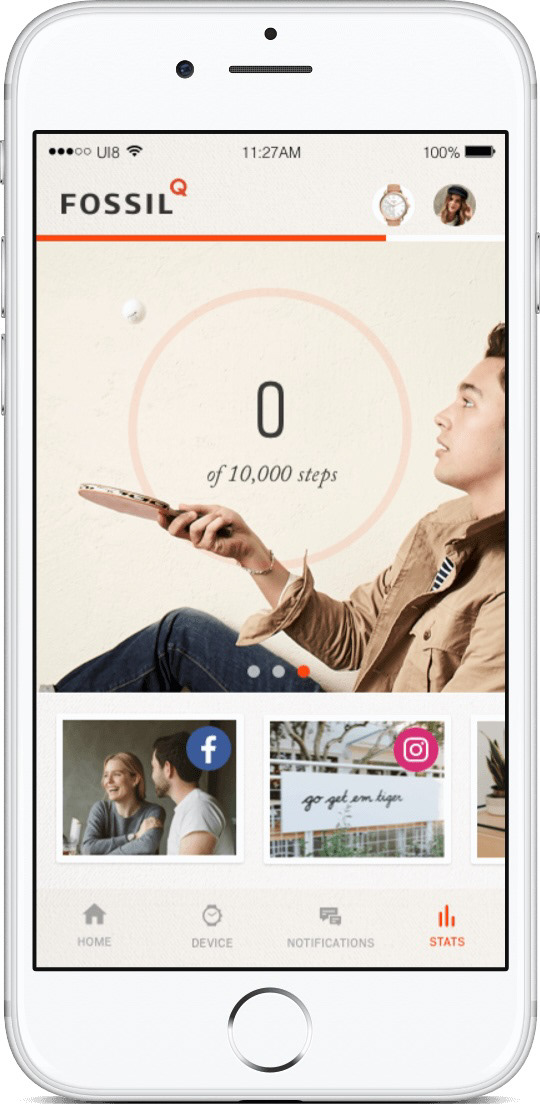
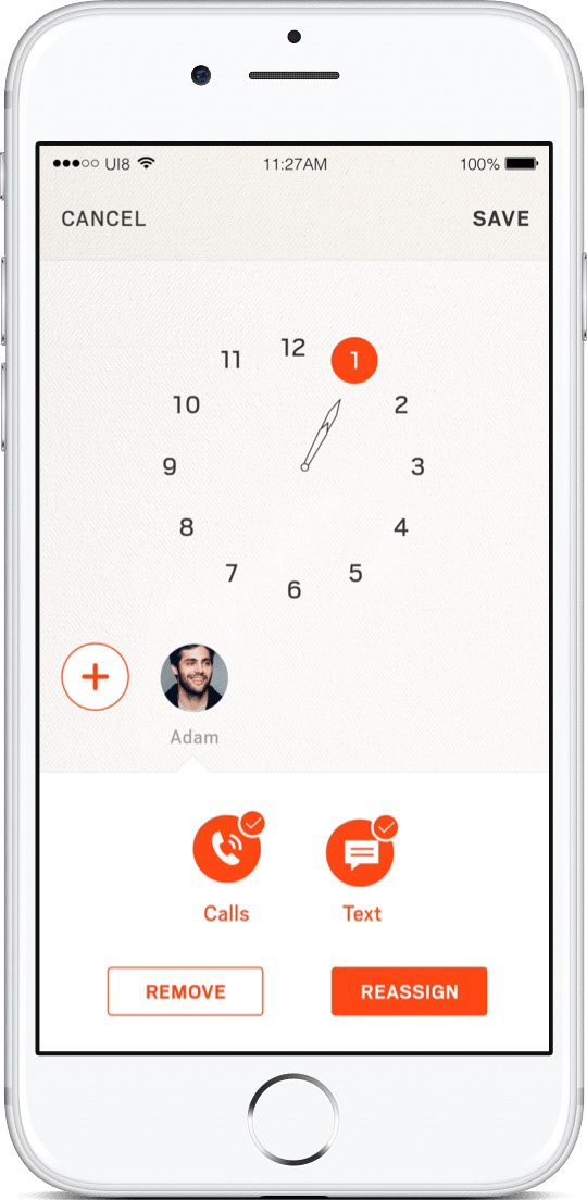
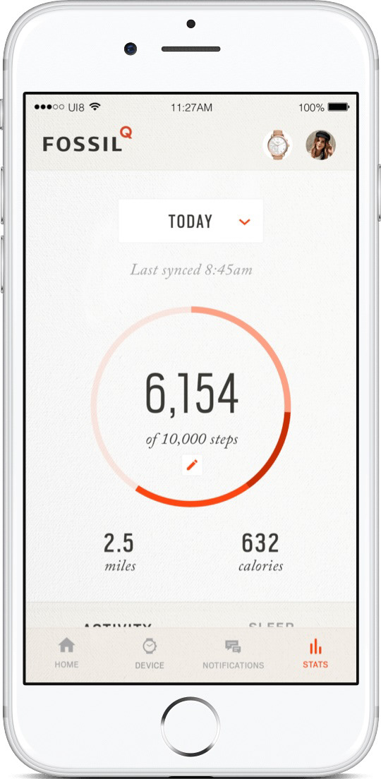
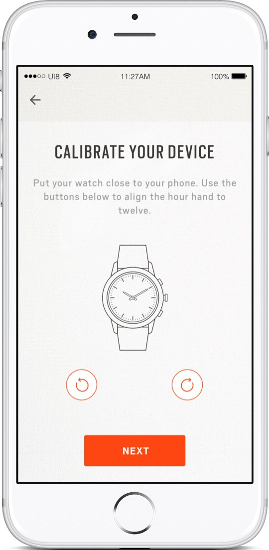
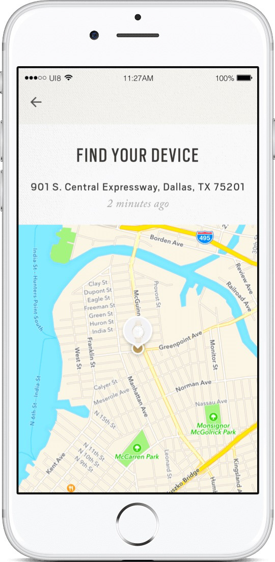
After conducting usability testing and evaluating tech lift and scope, our best route was to create an experience that would hit two birds with one stone, meaning both device and no-device users would see the same exploratory/discovery experience.
No device paired
Device paired and logged in
What would I do differently if I could do it all over again?
Create more hands-on learning of the design process and design thinking for brand teams within the workshops, brainstorming and ideation sessions
In retrospect: Design a more visually streamlined app to reduce challenges with asset management, increase speed of future scalability, and meaningfully utilize screen real estate